
Contra
Made a busy freelance web app simple to find your way around
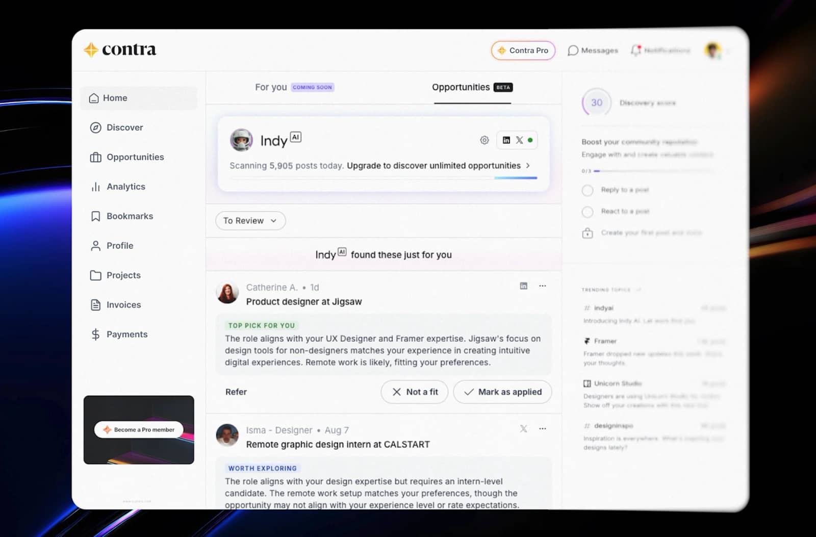
User experience for Contra's web app, the place where independent professionals find work, manage projects and get paid. The goal was to make every part of it feel easy to use.
The Problem
Contra helps independent professionals find work, show their portfolio, send invoices and get paid, all in one place. That is a lot for one app to hold.
As features were added, the app risked feeling busy. If people can't quickly see where things are, they use less of the product, and they don't come back as often.
What I Did
I worked on the user experience across the web app, focused on making it easy to use from the first screen.
A clear left navigation, so home, opportunities, projects, invoices and payments are always one click away.
A home screen that puts the most useful thing first: new work opportunities picked for each person, with simple actions like "Not a fit" and "Mark as applied".
Fewer, clearer choices on each screen, so people know what to do next without reading instructions.
Consistent patterns across pages, so once you learn one part of the app, the rest feels familiar.
Why It Matters For Growth
Good user experience is growth work. When an app is easy to use, more people finish what they came to do, try more features and come back.
For a platform like Contra, that means more people setting up profiles, finding work and getting paid through the product.